I just have to put these backyard landscape ideas down before I forget them.
You see, I just got back from a fabulous soiree with some of the brightest minds in design, and I am buzzing with creativity and ideas.
Take a seat, get your cup of coffee or tea close by and enjoy the trip trough the minds of the world’s top decorators.
And as a bonus, I’ll give you some adaptations in the form of some backyard landscaping ideas on a budget.
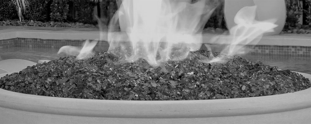
Here are some basics you will need, Fire glass, privacy panels, landscaping glass and a yard.
Rise of Organic Landscape Design
First “must have” going on for 2017 are natural materials and textures.
We want warmth among all the cold polished steel and minimal plastic our tech comes in. People are gravitating around biological indicators, to remind themselves of their “natural” origin.
It is a pleasant return to the style of the 70s and 80s after people got sick of the futurism of the 60s. Some will argue that this is weird considering we are still before peak tech and with AI just around the corner our technological endeavors will only get even more pronounced.
To them, I will argue that we put a man on the moon the same year Woodstock happened. The year of the greatest human achievement occurred the same year humanity looked inward and rediscovered their spiritual sensibilities.
Back to our roots
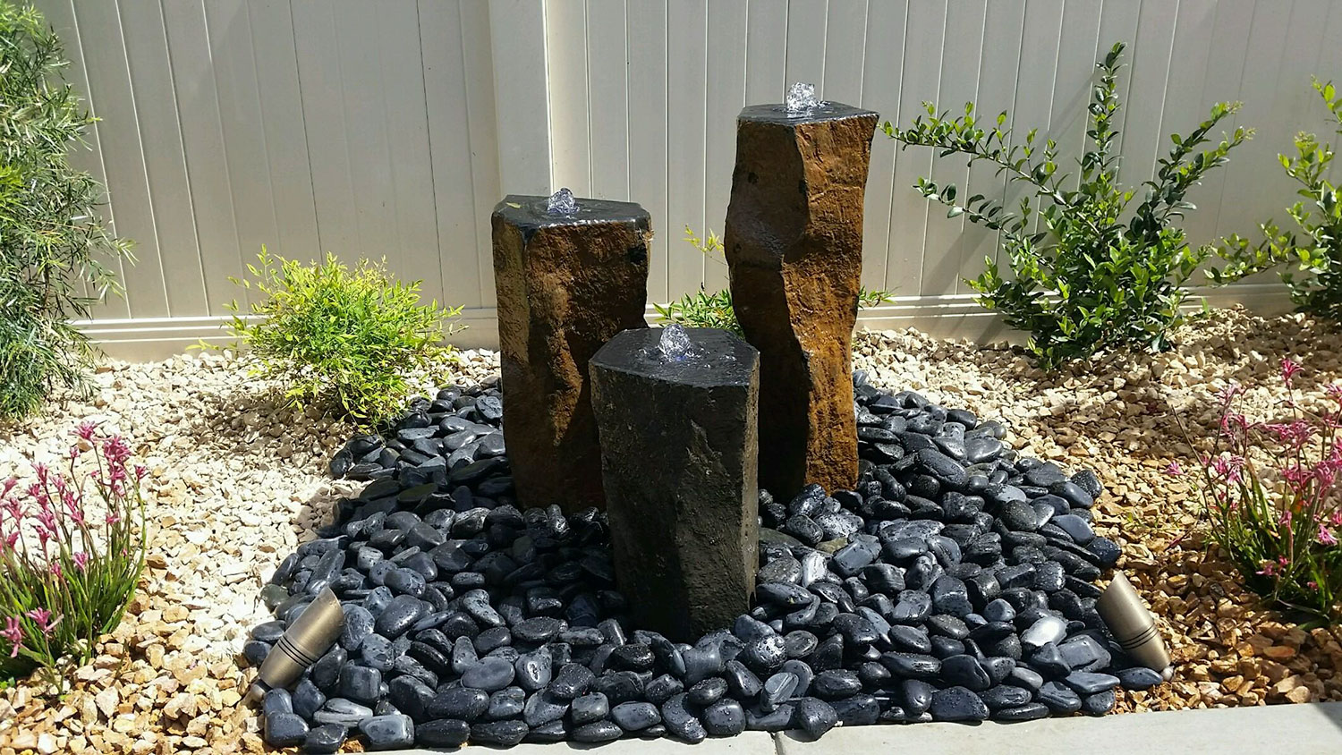
Natural tactile materials are all the rage. Rock is the new polished metal and smooth river stones.
If you have granite, slate, travertine, limestone and stacked stone lying around, use it in abundance. I was sort of a visionary in this case, as I’ve been preaching for dedication to natural patterns and textured surfaces for some time now. However, I am not going to say I told you so, I’m just glad people moved on from the “Can’t go wrong with polished steel” mindset.
This is also good news for the budget savvy. The budget backyard idea you should get from this is concrete and stain are your new best friends for the immediate future. With enough perseverance, you can turn any wall into a slab of Norwegian cliff face.
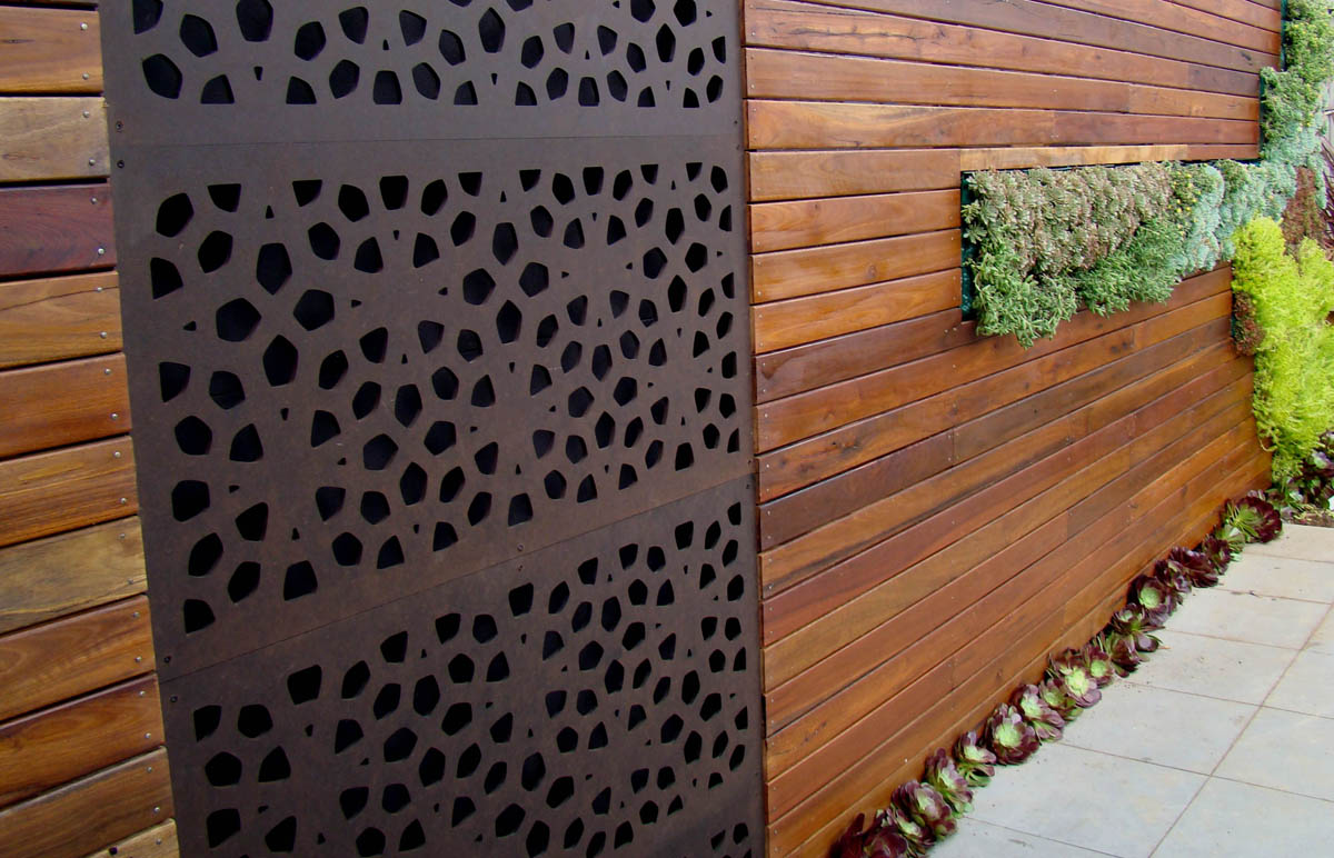
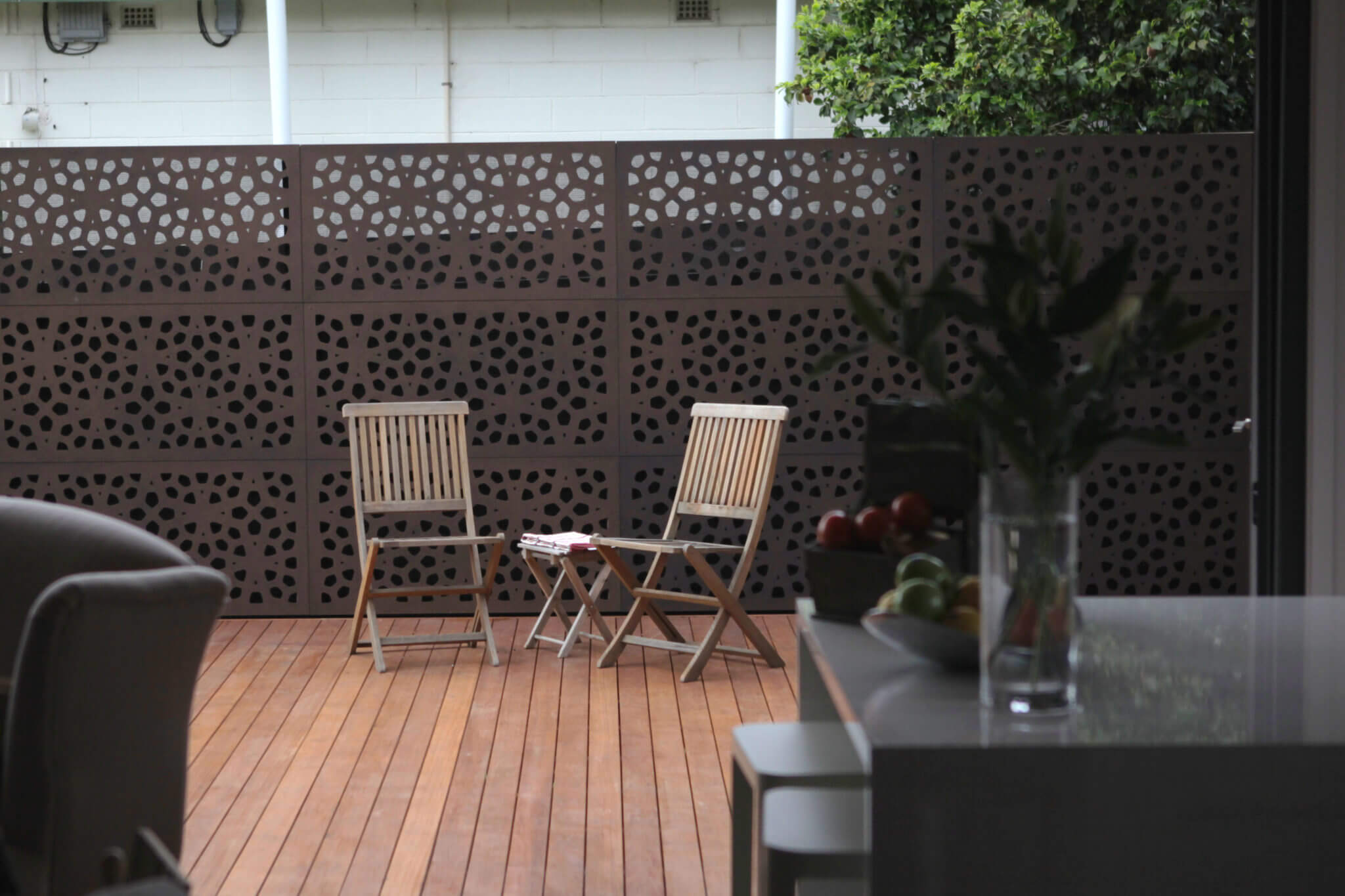
MARAKESH 24 x 48 inches – 80% Privacy
Faux sure
And forget about all that faux mumbo jumbo. DYI is in this year in a big way. The rule of thumb is, if you can make it yourself, it’s cool.
Online designers that have been influenced by big design trends have finally gone mainstream and have started a feedback loop, changing the larger trends of the industry. This means that effort and innovation trumps rules in 2017. Better said, personal touches and artisanal works are the standards for 2017.
Don’t be concerned about ideas or rigid design, free form is also in, so no need to stick to rigid structures or themes. In fact, as you’ll see later, designers are breaking all the rules this year mixing and matching sizes, textures and heights like crazy. It’s a brave new world for design.
Old is gold
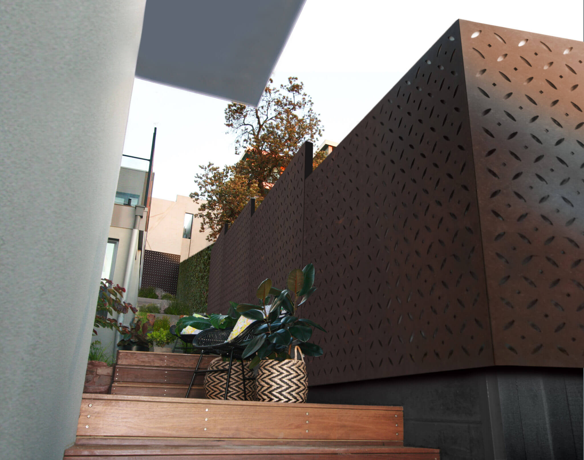
Old-fashioned design elements and features are back. 2017 is all about fusing the old with the new in a complementary fashion. It’s like our culture is trying to reconcile the character of old-school with the utility of the new. It’s quite poetic. This means steel chairs with concrete tables, Flagstone paths with landscaping glass accents, Zen fountains and sheet metal planters will all define gardens in 2017.
Be bold and blend elements into compelling, shocking ways. I know it sounds scary, but keep your intent clear and don’t combine more than two elements and you should be okay. This is an excellent time to go to that garage sale or your grandparent’s attic and find some vintage pieces. Most of those steel assets can easily be reconditioned, and for a few bucks you get a rare piece that would cost a hundred times as much, and you probably couldn’t find in any non-specialty shops.
Not going to lie, this year won’t be accessible for newcomers, but I think it’s a sign of well-needed maturity in design. Putting some beautiful river rocks in the white sand wasn’t design, it was an art project. And one that everyone copied their work off the one student that actually did put the work in and did something innovative.
Revenge of the plants
Along the same lines of reimagining the 70s, houseplants are back in a big way. Modern man is tired and needs some distraction, needs to make his home feel like home again instead of a casual office. We shoot for the stars and the apex of our business environment, but we need some roots to ground us(pun intended).
That’s why we are seeing a resurgence of plant life. For years we thought that the gardens of the future will just be lifeless fusions of concrete and gravel, and the only indoor garden we will get to will be the zen garden. But apparently not. Plants are coming back in a big way and even conquering the inside of the house, an area millennials we’re reticent to experiment with, until now.
Believe it or not, I was one of them I hated indoor plants, they felt stuffy and moist and intoxicating when in bloom. Ironic, considering what I do for a living. Now, I actually miss them, I get a weird feeling that the house is too sanitary, too artificial.
Modern Landscape Design Fights Back
But despite all this, modernity is not going down without a fight. Solid color blocks are hard and bold assets. And in a year of clashes and stylistic conflict, it would be impossible not to use them. The same can be said for clean and smooth backgrounds or solid, colorful surfaces as counterpoints to more organic floral assets.
As a budget backyard idea, this is great news, this means that to have an in-season fashion you can get away with a plaster square or a clean concrete wall. No money, just bravery and a little bit of know-how.
Throwing pillows in solid bright colors, cubicle bright red tables, or yellow brick paths are all reasonable options. Obviously, don’t use them all at once but feel free to be bold, especially with cheaper pieces. I want to abuse this year’s liberty and try some yellow or lime green terra cotta pots.
Fence, Sectional, & Privacy Paneling
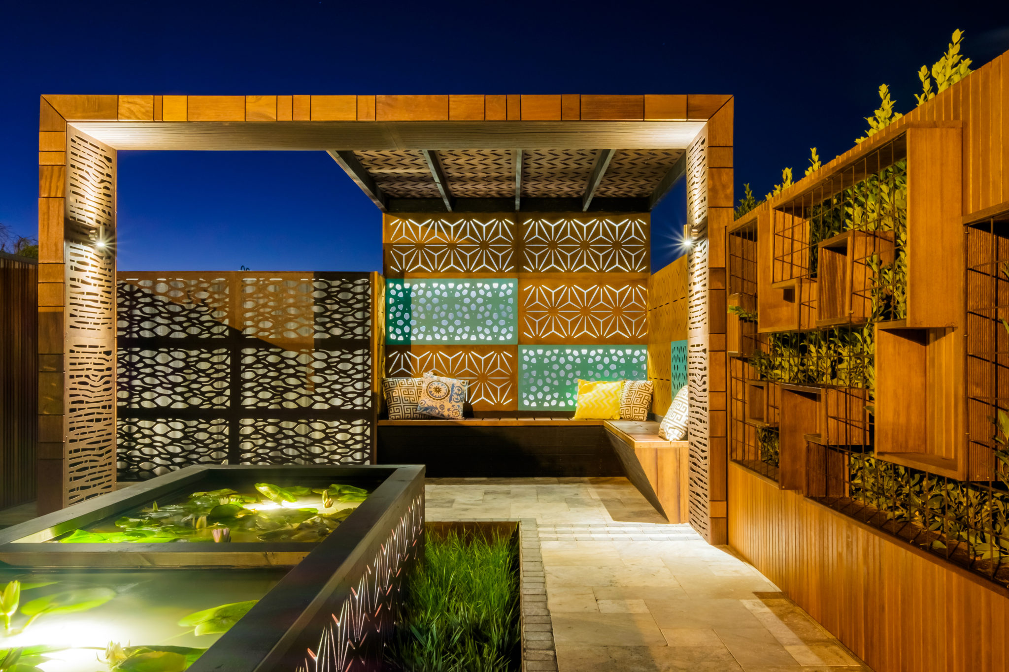
Inspired by online designers, the square white minimalist wall panel is the must have an element of both outdoor and indoor design.
Its expositional nature makes it an excellent minimalist background for any feature you want to underline. The simplistic understated surface makes anything you put in front of it pop out and shine. Its ambiguous origins make it extremely versatile, you can build it out of anything you have on hand, from marble to cork or cardboard. Like with most DIY, if you make it work, it doesn’t matter how you did it. Now, what plant do you want everyone to notice?
If you have some old separation panels or privacy walls, give them a new finish and use them as backgrounds for a “faux” Instagram photoshoot starring your favorite cacti or palm. You can view a view ideas of what great privacy panels can do for your yard here.
Create some segmentation and add volume and angles to your yard. Volumetric complexity is always a great plus. And while we’re on the topic of size, go as high as you want with the paneling and finally integrate that lateral wall into your patio completely, add some wall hanging greens and turn the patio into a much larger proposition for the casual viewer. Be careful not to over promise. The view needs to be just as grand as the environment. Otherwise, awe quickly turns into disappointment.
Fusion of modern and hyperrealist old
This is a fascinating phenomenon. You have traditional elements like DIY planters mixed in with new surfaces and exotic, colorful plants. It’s like the new chic; poor, shabby but tasteful and elegant.
It’s a very fresh mix of style and taste and basically, puts every timid rule designers used onto its head. You won’t be able to get away with a well-kept garden and two water features this year.
The wall panel illustrates this in an excellent fashion. It’s very easy to make it bland, but it’s cheap and easy to try out. So it doesn’t matter if you get it wrong. And if you pull off you have the best excuse in the world to show off that unique little plant that you know is your favorite and you wanted to show off for so long.
That’s what 2017 design is, it’s big boy pants for designers to prove they are ready for the big leagues. I would recommend keeping backgrounds simple and clean. Concrete, plaster, clean bricks and then add a few simple elements arranged however you want.
Keep it on rotation, change it up every week. I bet you will run out of ideas before the month is up, but keep going. By spring, out of boredom and frustration of not having any new ideas, you will come up with something brave, something that you just put together out of impulse. That something will, however, be fresh, exciting, innovating and very pleasant. Congratulations, you have just created a design.
Glass and rock
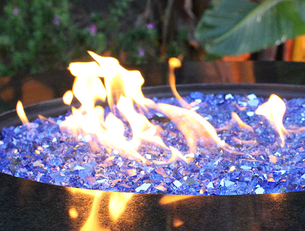
One of bravest directions I’ve seen was that of landscaping glass as the new gravel, linear ponds of blue landscaping glass surrounded by dry gravel and harsh dark greens that bring to life the environment in some new hyper-realistic way that would make a minimalist scream. See some examples of landscaping glass in action here.
Light, bright lawns are out, strong dark fake turfs are in. Released by climate circumstances from the obedience we had towards the “natural feel of grass, ” and with the confidence that the greens around the turf are more than sufficient to keep the yard organic and natural, 2017 opened up a lot of options regarding ground cover. Anything you ever wanted to try is fair game now. Be bold, be confident and give your garden a vibrant background.
Think of it as a reversal of roles, before we used the ground as a space of exposition for the main event, now it can be the main event and add effervescence to the whole garden in one swoop. Go wild with the synthetic turfs, or even darker weirder colored grass. I don’t know about you, but ever since I saw blue grass, I wanted to experiment with it. And now I finally can.
Simplicity and structures
This is the new rule of the game. Clear intent as always when using bold elements and clashes of styles but the new twist is structure. Everything fits together like a puzzle. The composition of 2017 is very architectural. You can see the layers the planner had envisioned, and it’s almost like peeking behind the scenes of the show. We’ll talk more about the self-awareness of this year’s design in the next section.
From the Pinterest-like wall panels that display hanging pots of terra cotta to the 2 tiered flower bed with variable height, everything looks like a design feature meant to post on Instagram. Everything has to look well on its own and then the powerful part is pulling it all together and make it work as a whole.
Contrast in foliage, height and forcing complementarity are the new challenges that you need to fit together. This means that we’re going to see a lot more diversity among the plants we use in our designs.
Bushes, dwarf shrubs will replace the hedge and the lawn, and you need to make them work with edible gardens and modern materials. I know how it sounds but follow the rule, simplicity, and structure. Create a background, simple, clean hardscape that is “Instagram friendly.” Then add your main feature, something wacky like a large spread succulent and then surround it with something complementary, like some colorful ground covers. Straightforward and structured, as if it’s assembled.
Water is the new zen
Nothing that was Zen is Zen and works anymore. It actually never did, but it was an excellent option for our increasingly more crowded living conditions.
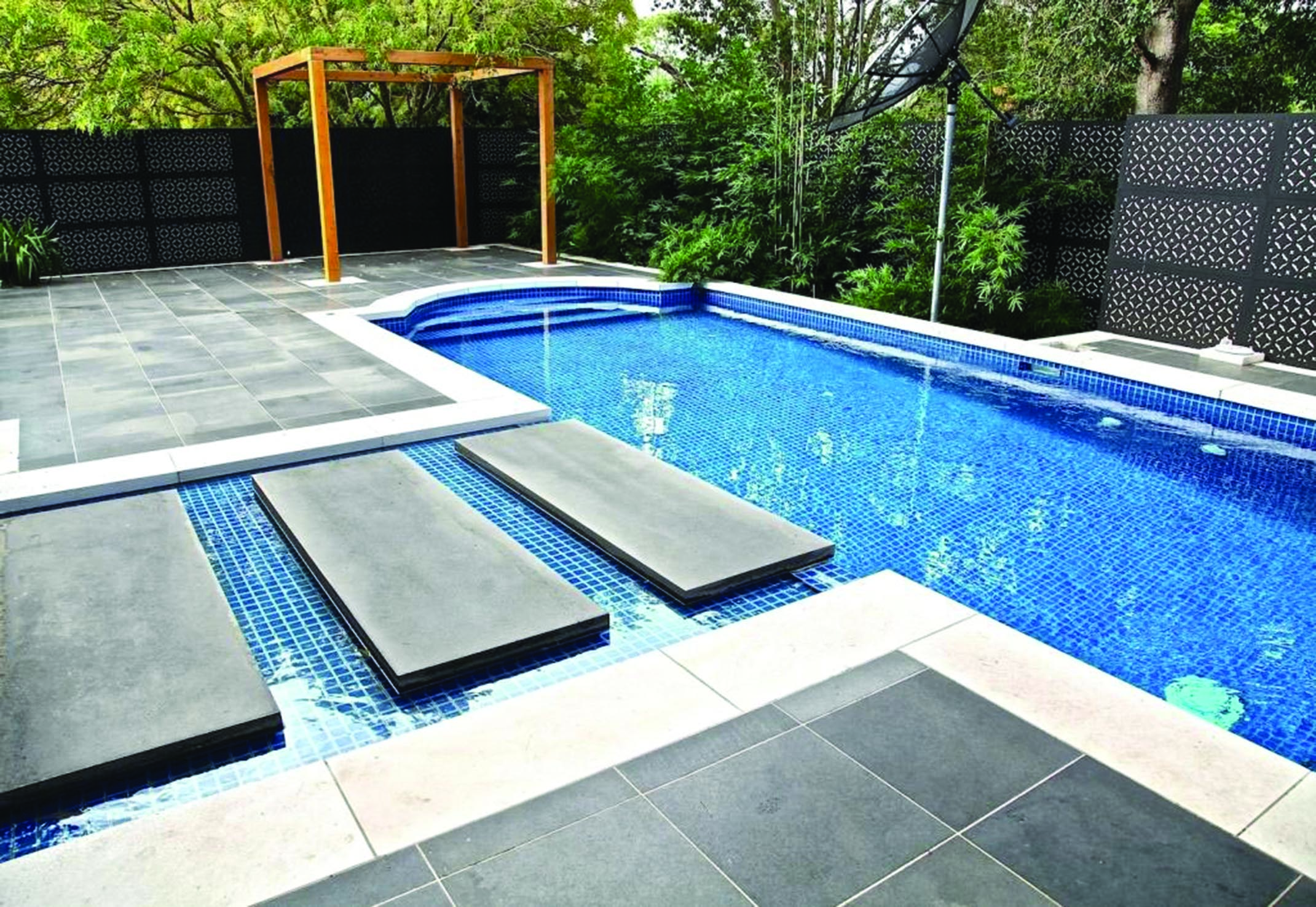
If you want a cold clean look, you get it with water features. Fountains, waterfalls, and ponds have punched out the oriental look and are now in the driver’s seat when it comes to offering tranquility and a peaceful vibe. Again it’s a stroke of genius I would never have considered it.
Now I know some people will stick to their 15 shades of gray Zen garden. And you should, just give a water feature with some natural stone a try. Maybe put it somewhere in the corner. Cut back on the texture if you will go for marble or some dark lava rock as a background. It’s still peaceful, but it’s a lot more vibrant.
For the rest of you, there is a water feature for every size garden. The bigger the better, if you have a farm, go full size with a pond and fountain. For a patio, you got to have at least a waterfall, especially in some beautiful granite. If you live in the city and you only have a shared space yard, try a simple concrete fountain with some fire glass at the bottom for that added liveliness.
If you haven’t been all that daring with your landscaping until now, this is an excellent opportunity to try something more daring than a privacy wall.
Also if you’re limited on space; our small backyard design ideas 2017 guide can help you make the most of your space!
Eco Friendly Design Awareness
Another direction for 2017, as I previously foreshadowed is a growing sense awareness and the spread of design with consciousness that is self-aware of social issues, and how it impacts the rest of the world. The increased pressure from the drought made sustainable design a must have for a lot of designers.
Therefore, you see many attempts to reimagine the thirsty lawn into mixed turfs. Designers predict we’ll be using all sort of mixed grasses and shrubs for coverage and abuse the difference in texture, color, height between them to keep the viewer’s eye entertained.
So how does that translate into a budget backyard landscape idea for your sustainable corner of heaven?
Well, this means you have free rain to try out some less thirsty options, plants that will also need less maintenance and you have a lot more options when it comes to filling up the sides of your path or corners of your living area. Use this year’s blending license to combine them with some of the more pretentious greens, and you get a more sustainable garden overall with the added pop. Desert plants, cacti, and succulents are the first tier in your design, especially if you live outside of the tropics. Combine small shrubs with your older trees and get an elaborate wall of greenery that will require almost no maintenance while still being very in season and stylish.
Do you have a smaller space? Replace your old turf with just a couple prairie shrubs, bursting out a gravel cover. It will give your garden a Wild West feel and allow you to conserve water. Segment it with some privacy walls covered in some south-western hanging foliage, and you get a great 3D garden with minimal hassle and cost.
Hyper localism
Another side effect of the self-aware design is the focus on hyperlocalism. Keeping your garden in tone with your climate zone shows not only insight but also responsibility and restraint. We’ve seen in previous years that with enough money the global economy can make anything possible. But we soon found that it’s not worth it. You can bring the rainforest to New Mexico, but it’s a parlor trick. It just doesn’t feel right.
All that is gone now. No more exotic plants or sensitive growers, all of them have probably been bought up by the new botanical garden in Dubai. You get to use local plants, in interesting new combinations and brave new arrangements. This is another upswing in the creative potential of backyard landscape ideas for 2017. Because just buying those expensive Japanese orchids.
Therefore, like with many other themes, the industry is hitting a hard reset and going back to the basics with a more grounded awareness of sustainable design. This deconstruction is opening up landscaping to all sorts of previous “do not’s.” All bets are off, feel free to experiment and make an effort to blend new exciting local options into your design. In fact, as you will see later, the braver the asset and the more effort you take to blend it into your design the better the design.
Live-in gardens
The other main direction backyard landscape ideas are heading for 2017 is that they reclaim the garden as a place for people, instead of an abstract canvas for design.
A movement I wholeheartedly embrace, and I think it will bring a lot more character and emotion to landscaping. One of the best “assets” you can have in your garden are a couple of children playing. Any scene will instantly come to life with the laughter of children. No doubt about it if you have kids, your garden should reflect that functionally, and you shouldn’t apologize for that.
Every garden should be created around people, it should be a space to be enjoyed from within not just experience from afar, quite the contradiction with the detached style of the “display style” of the layered visual aesthetic of the wall panels.
As a backyard design idea on a budget, the focus should be the living space, the lounge, the dining area or the playground. Everything else should revolve around that. I don’t recommend you make it an asset but rather the purpose of the yard. From there you can expand and create some definition, either with privacy panels, mid-high plants or some paths.
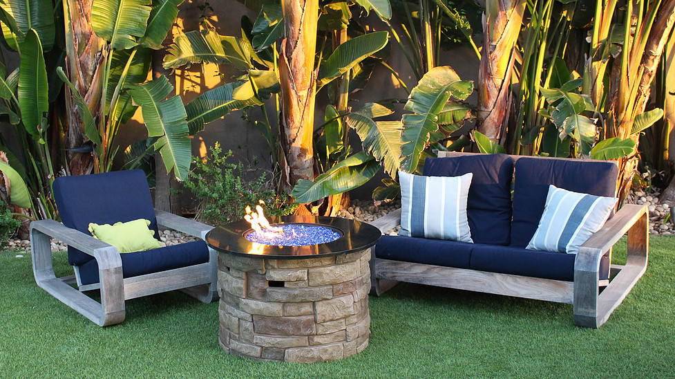
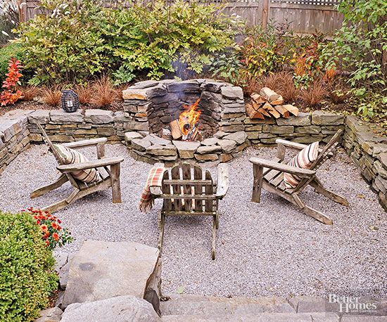
Regular readers should already know my affinity for firepits and the sense of gathering they imbibe in a scene. All living areas should be concentrated around the fire. If it’s a lounge area, make a gas fire covered in fireglass in the middle of the coffee table. If it’s a dining area, have a pizza oven or grill installed just to the side of the space, while in larger gardens go overboard and have a full-size fire pit with fire stones and bricks.
Homesteading
A big push in reclaiming the garden as a place for people has been in the homesteading craze. Gardens design to provide real life benefits.
This homestead theme solidifies a lot of previous concepts, localism, easy maintenance, sustainability a return to past values and creating a living space designed for people. And above all else purpose. It reinstates purpose aesthetic, the revenge of function against form. Now, that doesn’t mean form get’s neglected, we just have some new guidelines to design around. Think free bebop jazz is conquering the rigid form of swing.
Herb gardens and vegetable boxes have combined into The ideal element of utility and design. Bring back the grandparents experience of the old country and make some space for a mini orchard.
If you never even pickled your cabbage, this might sound a bit much. But give it a try. Start out with basics like cooking. Get the basics down and learn to cook a full meal, make mistakes, get it right and then improvise on the exact recipe. After a few weeks invite some friends over, make it an occasion. Call it a drinking night or board game night to relieve the pressure off yourself and your cooking. Surprise them with the food, enjoy their faces, gratitude, and joy.
There’s something we lost from previous generations, simple things like sharing a meal, making your own food and doing something more complicated than work, entertainment and leisure. There’s just some real depth to actually making an effort to live life and not just satisfying your needs.
Back to the basics
If you don’t have a 2-acre farm, you can still copy the style, there’s some nifty DYI vegetable beds and the loft with a herb garden is already an urban cliché.
Container gardens are very affordable and have a lot of character turning the greenery into a feature instead of just a natural asset.
Go the extra mile and design yourself a wicking bed for the ultimate in sustainable gardening. Planters like this make for a great mix of sustainability, DIY and have a tiny footprint both regarding space and water consumption.
Step it up even more, and you get greenhouses. This may be a little much but if you really want to go all in and have some less than optimal circumstances this can be a fascinating spin on the modern/organic duality with loads of character and room for personalization and making it your own.
Now, I am talking about greenhouses and wicking beds as design elements and features an homage to the history of gardening if you will. I totally get if some of you are somewhat reticent to invest time in vegetable gardens.
But be honest, you don’t need to play the piano to appreciate it’s class or be a avid reader to feel the warmth of a fully stocked old world library. This isn’t however for everybody, and I totally understand if it’s too much into function design. You can give your garden character even if you just stick to the living area and play area themes.
Playspaces
A second function used in homestead design is a design made for human activities, play spaces and event ready mediums add a lot of warmth and character to an area. I’ve already talked about the value of children’s laughter regarding the warmth of a garden, but go back into your own memories and think of the value you give them when the landscape is designed for play.
Also, I really want to take you back to your childhood memories when the garden was a place of fun. And this works even if you are an adult, keep that mindset. A place for fun. Maybe it is nostalgia or a bleed of Hollywood’s remake culture into landscaping. But there’s definitely something more there. It’s not a feeling or emotion we are chasing, no two people had the same childhood. Rather a mood, an atmosphere of less complicated times.
Atemporal bliss
It’s like taking a vacation trough landscaping. If you have the opportunity go to Sicily or Cuba,, where people have more green in their gardens than wireless modems. Try it, everything goes down a tier in terms of intensity. Simple matters like dinner and half empty glasses of wine become the life or death issues. And it’s not about the vacation mood, I worked out of Sicily. Work is still work. Just that it ends. When you close the screen, you forget about everything other than your immediate vicinity. It’s like a regression to your childhood. Then and there is all that matters, you forget the past, and the future is irrelevant. That quasi-ignorance is the opposite of flow or hyper-efficient work mode.
There’s a human touch to the state, something that instantly puts you at ease, allows you to turn off the tense part of your brain. That slowing down is what we are missing. And that’s what this new year’s design is trying to achieve. It’s not an accessory to life but rather the arena where life takes place. That homeyness is coming back in a big way in 2017, and in my opinion, it could not come fast enough, because you can feel the alienation in the air. We connected to future and forgot something essential for the human experience behind. We forgot to take care of our inner child, and I guess that’s what these backyard landscape ideas are trying to fix, we want to give that inner child a play space, finally.


