SUBTRACTIVE DESIGN
I’ve been talking a lot lately about outdoor privacy screens and I think it’s about time I write a post specifically about them. I love them. I think obstructionist elements are a godsend both from a financial point of view and a design standpoint.
Shop Our Outdoor Privacy Panels Here
Let’s be honest, changing landscaping elements and features are expensive and sometimes impossible as some things simply can’t change any other way than selling the house and finding one with a better garden. That being said this post will be a little different. Unlike other elements, outdoor privacy panels are subtractive elements, not additive. We will be talking about what they add to a garden in part 2. But first, let’s talk about subtraction and the difference between creating a concept and following rules.
When we construct something we add elements one on top of another, we do this with colors, perspective, or shapes. There are some things that trough experience we see are visually pleasing and others that are not. So it follows that to get something pleasing we just not do what isn’t. Creating an outdoor privacy panels design goes further. Just adding elements or textures is not enough.
We also need to subtract, to remove certain features so that people who view our work only see what we intended them to see. This requires you to consider the effect and goes beyond just following rules. You need to visualize the consequences and the possible variations that can occur. For example during winter, late summer evening sunsets or spring surprises. If you are a long time reader of this blog you know I already prepared you to think of your scenes as real life tableaus that people are seeing and living in instead of just a set of does and don’ts.
Essentially, I push you to think about design as a viewing experience, more movie than anything else. In doing so you have to not only show but also hide what you don’t want to show, what may be distracting or irrelevant. The stronger the elements you use, the more you need to clean up and remove distractions. This is the peril of over design, and just throwing element after element into a yard.
Elements that could very well be nice on their own or even work as 2 or 3 within a theme, but then you get 7 or more things in a single space and the eye can’t focus, it starts to look like an art gallery instead of a place for people to meet and get together.
OUTDOOR PRIVACY PANELS
If we think of visual impact as a doodle and subtractive design is an eraser that allows us to correct or improve your stretch. The most used trick is obstruction of view or hiding things. Whether it’s yourself in a gazebo, the sun, a run down wall or a sloped garden corner. The trick is to think of removing x element of the feature as actually being a plus and something that adds to your yard.
Try this experiment, look at your yard and ask yourself what would you remove, and then think about ways to at least remove it visually. Coverings are the easy go to.
Alternatively, you can distract or integrate the issue into a bigger feature. For example, as you will see in a moment, the strong blinding sun can be turned into patterned lighting or a boring white stucco wall can become an amazing indirect light source if lit from beneath and covered by a screen.
For general information about privacy, check out this link. I’m only going to cover design arguments for outdoor privacy panels. Garden screens usually have a privacy rating between 60% and 90%. Privacy panels limit visibility from one side to another. So it goes from saying about half of what you would normally see to just one tenth which is a massive difference even if the numbers look close.
In this sense privacy or the subtraction of view from the outside in. this creates intimacy and relaxes the subjects confined in the scene.
Even with semi-transparent panels can make this work if there is more light on the outside than on the inside. This means that you can get the intimacy without the isolating effect of more closed off features.
The effect is multiplied with less transparent panels. But it comes at a cost of openness and light. Don’t use panels with more than 60% privacy to close up a small space. But if you have small spaces, you should only segment or shield never close off a section of it entirely. Segmenting is layering an obstruction in between the background and the viewer. This adds volumetric complexity and stimulates the imagination. Shielding an area cuts it off partially from the main area and creates a strong differentiation that enables both visual load and thematic complexity.
For example enabling a playground without making it feel like a place you just store away your kids when you don’t need them. This is also a great illustration of creating by removing. By cutting the link between the area and the rest of the garden, you can make it more cheerful and release it from the thematic restrictions of the main area.
CARVING SPACE WITH OUTDOOR PRIVACY PRIVACY PANELS
The other side of segmentation, this time viewed from behind the panel is sculpting space. Outdoor privacy panels remove limits, corners. They can create a concave decorative wall instead of the rectangular end of a yard, shape a path out of an alleyway and create layers out of the vertical face of a house.
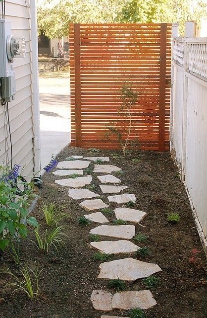
This is an interesting subject for me personally, I dislike mazes. But they are the kings of carving a shaping space. They cut off the individual from the yard and force a close and intentional focus on the immediate space. This can become tedious in my opinion over long stretches of time, but that’s why I see garden screens as an upgrade. They do the same thing, cut off view and force a limited perspective but they release it quickly. With a screen, it’s very hard to isolate and confine. It feels light and only suggests isolation instead of promising it.
This is a super daring example of carving up space. You could have made it a simple boring path in between less than flattering walls, but instead, the designer made the path at an angle. The flagstone is making it clear both that this is the start of n adventure and that things will be anything but boring as you can see with the random distribution of stones and the diagonal white path.
Furthermore, to make sure everyone walk that path to adventure, the designer purposefully blocked off one face of the entry, forcing people to come from the side. This has two effects: First, it slows them down as they need to turn and can’t rush past the design. And two, it surprises and makes them look around and be seduced by the light flagstone steps that are yelling: come on a whimsical adventure. Take note that these are the only two elements that were used, the rest is just the environment.
PAINTING WITH LIGHT
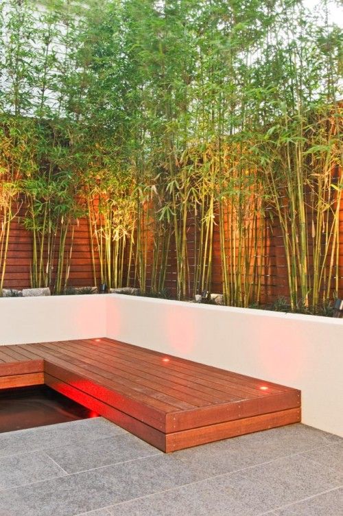
This is especially true with the heavier Arabic themed panels but true to an extent with all of them. The subtract light and funnel it into an area in colorful beams of light that cast a glowing pattern of light over the area behind them. This is the second most common use I have for outdoor privacy panels. Light is essentially the fundamental element of visual arts, everything we make gets created with light. This is a lot more profound than you might think.
Take this bamboo, within this light, it would be dark and crowded at best especially in front of a dark brown wall. But look at how underlighting can transform a backyard. It creates separation, space, contrast. It opens up the short space between planter and wall and brings vibrancy into what would be really pale color tones in any other form of light.
It’s a lot of work, but consider what type of light and what temperature it has when it falls onto your elements. Everything looks good during the golden hour when all the magazine pics are take. The challenge is to make your garden look good even in the mid-summer noon sun or the gray overcast of a January morning.
Similarly, to that trick, you can replace the bamboo with a garden screen and get space and funneled indirect light. The hint of space is seductive and creates the illusion of a continuation of space because we associate light with volume. We want to believe that there’s more behind the garden sheer than we have access to. Our brain thinks that this side of the wall, the darker side is actually smaller than what lies behind it.
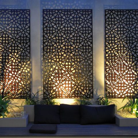
As you can see the outdoor privacy panels effect is stunning and considering the price, I am astounded that nobody does this trick especially when they are on a budget of have space restraints. Use an indirect correlation between the intensity of the reflection that is determined by the intensity of the light, the reflective properties of the wall is and the privacy rating of the garden screen.
Use a darker wall for more the illusion of space like in the case of the bamboo with more powerful lights and lower intimacy ratings to maximize the impression of space like in the case of the bamboo. Or a brighter wall to use it as a light source, in which case the intimacy rating serves to make it more or less atmospheric. But more on this later when we’ll cover oriental style garden screens.
GARDEN SCREENS AS A MODULAR, CHEAP LIGHT SOURCE
Consider the use of shade to limit detail and clutter or creating highlights with light over what is a flat feature. Light can become much more than a utility it can be a feature, a tool or the centerpiece itself. Sometimes you just have too much light and you don’t want to make a day out of night, so you just tease the scene with light. Works great with large open rooftops or yards, where you can afford some shielding and still maintain a view.
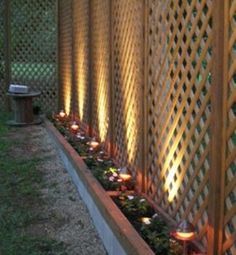
A secondary way you can play with the light I covered here, this is technically a using it for its visual appeal more than subtractive properties but I think we should get rid of this tip while we’re talking about light. Some scenes are small enough that any form of direct light in the night time is either too little or too much. That’s why I prefer reflexive light.
Light going up a vertical surface, lighting it up and making it light up the area in the term. For this, you can basically use any surface but I found the modularity of the panels and their low costs to work very well and enables me to get creative with where I position them.
To keep the glimmer to a minimum I use dark matte panels with a very low 60% privacy coefficient. I just need them to catch some light, and nothing more. And the best part, garden screens set up like this as light sources are cheap, light and portable. You can arrange them in any configuration anywhere across your garden and they become a feature, a light feature that is both functional and beautiful.
FAKE WALLS
The last tip relies heavily on the outdoor garden panel to be visually pleasing. So another obvious feature of garden screens is their visual appeal And how to use them as surfaces. The first way and the most common use I have for them are doubling down on the walls.
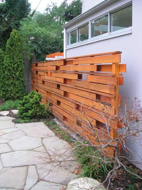
Face it, unless you have a Dutch painting on the wall or an original Banksy walls are boring. The expensive alternative is covering with hardscape.
The cheap and easy one is to fix some low privacy paneling over them. Letting a gap in between them and creating a second skin like appearance over them. For added designer points, combine my previous point, add some lights in between the wall and the panel, and make the wall a pale source of diffused light radiating through the outdoor privacy panels.
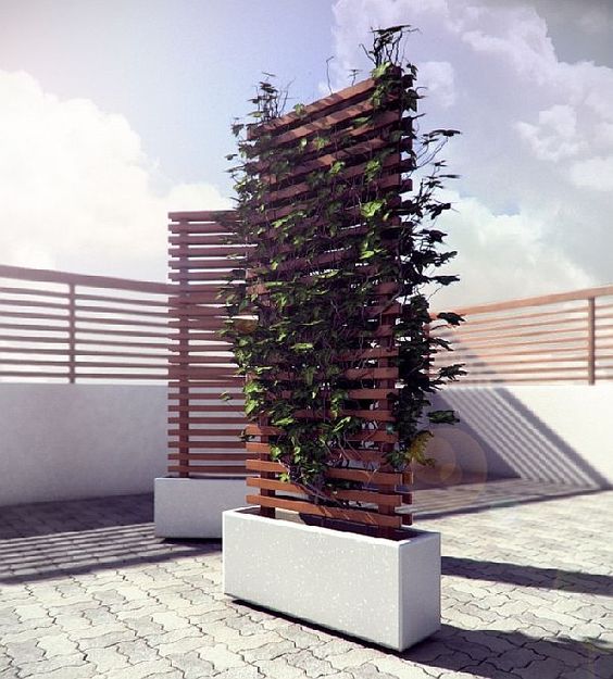
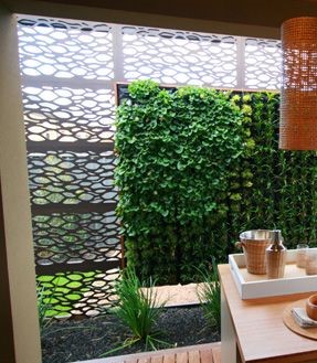
A secondary option, this one being the most common used by most designers is to use them as a backdrop for plants and foliage. To be fair a green wall is a great alternative to most planters and it also looks slimmer, lighter and more modular. This time you use however outdoor privacy panels with a high intimacy index and use them as a wall.
I would like to note that while segmenting a small urban yard with green walls is a great way to kill 2 birds with one stone, as I wrote about here. It’s very easy to make a green wall crowded so use restraint when handling extremely small spaces.
VISUAL APPEAL OF DIFFERENT TYPES OF PRIVACY SCREENS
I mostly use three themes for the outdoor privacy panels, but you will find a lot of overlap and variations on the design. But functionally there are geometric, organic and oriental. The first focuses on patterns created by hard bold lines and familiar geometrical shapes.
The second emulate the shapes and lines of nature and appeal to our more decorative sensibilities and the latter focuses on funneling light trough small openings and combine the geometrical patterns of the first with the soft lines of the second.
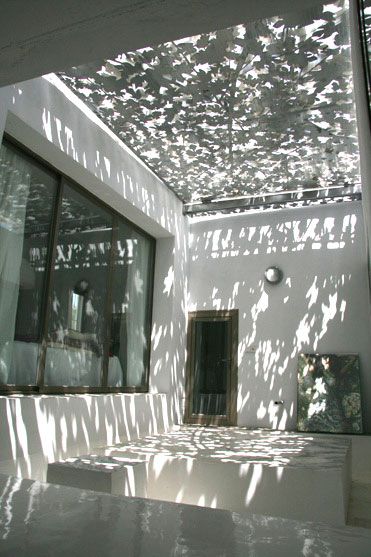
Very rarely you can do both and create projections of organic lines. The finishing looks blotchy, and it looks like you tried to get the canopy feel but you messed it up. IN this case, it works, and it’s a very bold move. The reason it works is because space is white and bland and every splotch of light becomes shiny and decorative. There’s no conflicting elements or material distractions, it’s just a white canvas painted with light.
GEOMETRIC OUTDOOR PRIVACY PANELS
This is generally great as a base fake wall, or background. The simple shapes of the outdoor privacy panels don’t really do anything special with the light unless you put some fabric over it, but at that point, you turn it into something you always need to adjust.
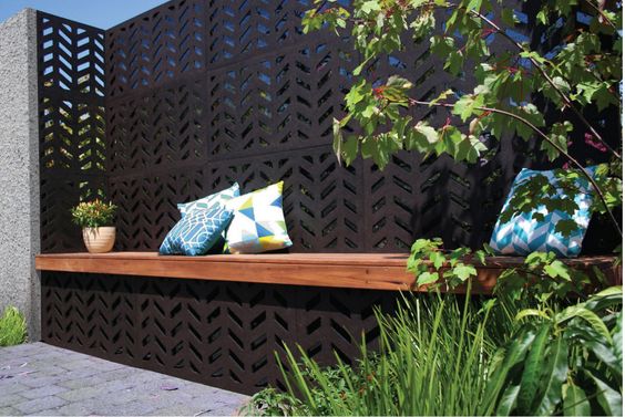
A gimmick more than a feature. So how do you grade geometrical patterns? It’s all about how hypnotic the patterns is. The wall needs to be less of a wall and more of a background band supporting the lead singer in front. Either with a steady baseline like in the case of this Herringbone pattern that offers a base support for the bench without closing off the patio completely from the outside.

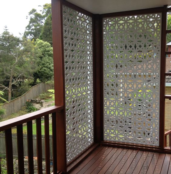
Or with something more seductive like a jazz band groove, like in the case of this Mahjong fence. For me, it’s a no-brainer and the Mahjong tiles are just enthralling in their alternating pattern. Notice that everything else is more than predictable and not particularly interesting but the whole scene is still mesmerizing because the screen’s 60% privacy is enough to suggest bait your curiosity of what may be behind it.
You don’t loose space, you make it more interesting and it excites you. This is an amazing example of elegance and restraint being as interesting in the details as whole other centerpieces.
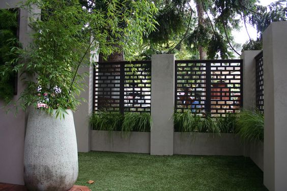
A good takeaway would also be that the lighter 60% Mahjong is more impressive and vibrant than the 80% Herringbone, despite the fact that the Herringbone has a zig-zag pattern. The light colored negative space more than compensates for the rectangular static lines.
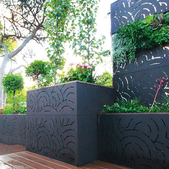
This is usually the rule until it’s not anymore. Bellow, you can see the 90% Cumulus pattern. Technically based on circles so it is geometrical. But look at the tension of all those broken circles, it’s like a slow-motion explosion.
I chose this picture especially so you can see the difference between white and dark negative space within great patterns. You can see that the dark grooves provide a restrained pattern, the design and the tension in the shapes do the heavy lifting.
But when exposed to backlight like in the top right, the negative space explodes and comes alive with light. Cumulus is an amazing pattern and you can see here it’s versatility both at providing an interesting background and funneling light.
DECORATIVE GARDEN SCREENS
Decorative screens have a less structured patterned. They try to feel warmer, more natural and in doing so they offer a great organic feel that allows them to be integrated into an older less modern garden easier. As a start-up example, look at the 60% Leafstream.
The shapes pull your eyes like the waves of a fire. The dynamic patterns are very fluid and I wouldn’t use it as pure background. But for hinting at the space behind it or inducing movement in the eyes of the viewer it’s an excellent choice.
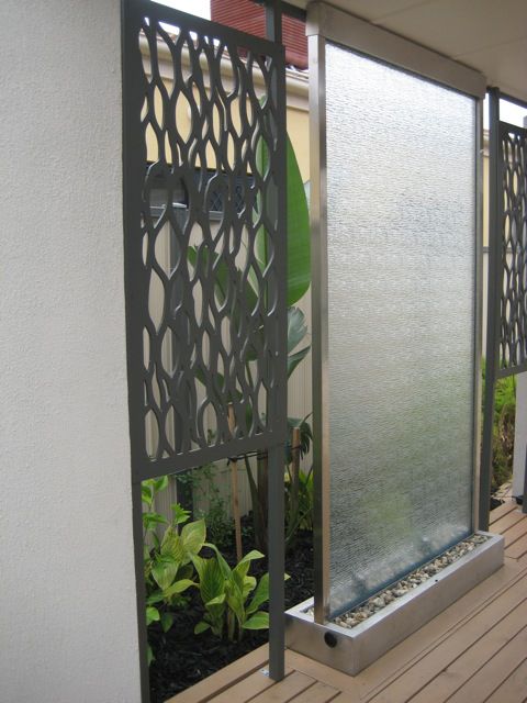
This open transparent look makes it ideal for playfully obstructing view without closing up and reducing space one bit. This is a favorite for small yards where you lack a lot of light because these outdoor privacy panels has almost no obstruction. Speaking of light, this is ideal for creating faux walls and use in between lighting because of it’s low opacity rating and playful vibrant curves.
This design does come however with some limitations and I would say you to really think about it before using it because it’s not all that restrained, and subtle so it will clash with some dry abstract themes. So let’s get on to some patterns that are less of a hassle to match and are more versatile.
THE PACIFIC ISLANDER OUTDOOR SCREEN
Daintree is inspired by pacific rainforests. It’s wavy and less linear, but comes with an 80% block out rate, making it suitable both as decorative outdoor privacy panels and as a background. The large openings also leave enough of a view for the eye to grasp the space behind it.
Making it a great option for wall coverages. Just keep in mind the limitation of the 80% rate. This doesn’t work as a light screen for background wall light to reflect trough it and it doesn’t really hide any rubbish or bad finishings all that well.
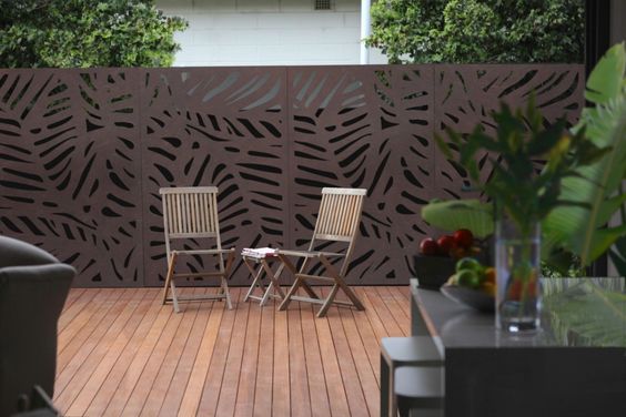
But what it lacks in practicality it gains in personality, especially over small spaces. This is a outdoor garden panel that can stand on its own whether inside or outside, like an abstract piece of rainforest. For best uses pair it with modern clean cut elements that need some softening up.
Works well with modern wood, concrete, and glass as long as they are not very clean. Consider this as a good option for segmentation and teasing privacy. A very good all-rounder you can get, play and experiment with.
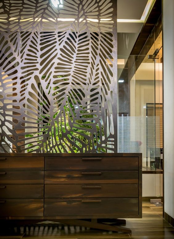
Where Daintree is weaker, bungalow picks up the slack. This is a Leafstream with 80% coverage and perpendicular elements. This is a building panel. The small nerves give it stability and allow the patterns to join up and be used for covering large surfaces.
And as a secondary use, you can play with it under artificial light, whether by reflecting it on it, from bellow or on the wall behind it. The linear elements also make it less contrasty with the straight modern design.
But That comes at a cost as it doesn’t pair as well with organic features as the previous 2 decorative patterns.
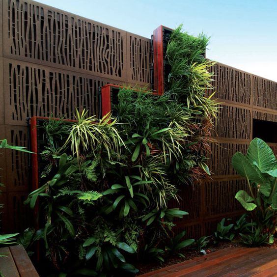
And now for the piece of resistance, the brand new Wooloomai 80%, this has however so much block out and the spacing is so small think of it as an 85%.
It could be considered oriental in how well it funnels light but the curvy lines indicative of old medieval Japanese abstract representations of the sea makes it 2 tiers more decorative than any geometric based pattern you can find in any other oriental screens.
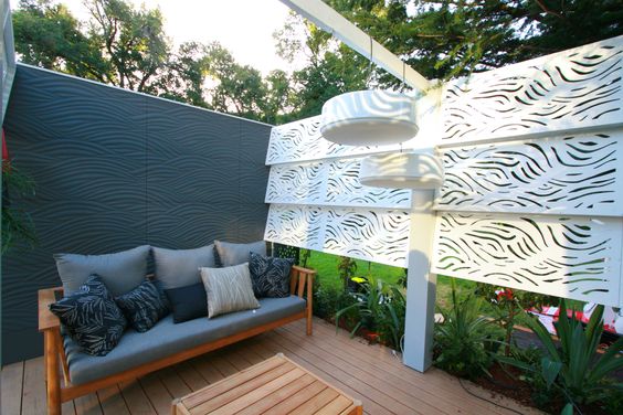
So what can it do? These outdoor privacy panels can cover, they can provide some very subtle background. Very restraint and feminine cover for any rubbish or boring walls. Nothing special, until you add light to it, behind it or in front of it.
The small wave lines funnel light beautifully so whether you’re funneling the sun or indirect light coming off a back wall, you will activate all those wave lines and infuse your sitting area with a unique mood that is hard to describe even for me.
If you used oriental screens before, it’s something similar but more decorative, playful in the patterns of light cast.
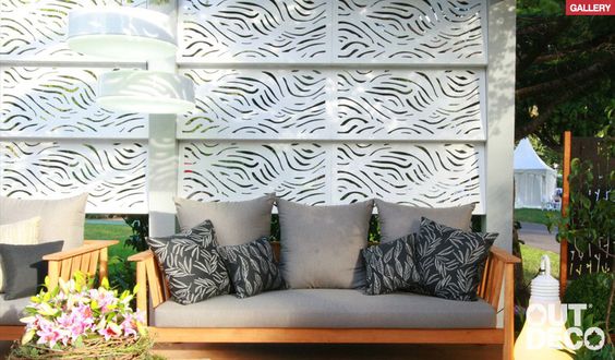
Another fantastic feature is how well the negative space looks when you turn it into a light-colored feature, the dark openings look like a tridimensional organic mural that just grab your gaze over and over again with their sensual dance.
Oriental outdoor privacy panels
First one, and the most versatile is Marrakesh. It works as background and because the patterns are very small and restrained on oriental screens you can easily pair them with both modern and classical design. This pattern is especially old and has a medieval hint to it so any old world to the colonial theme can work. But more importantly, this is a great light funnel for those just starting out.
Try it out, get one. Find a low, morning of the evening sun, and obstruct it’s light with one of these.
The area behind the panel will light up and the pattern projected by the funneled rays will create dreamy golden patterns that will imbibe the patio or deck with that 1001 Arabian nights mood, regardless of what your theme was before hand. That’s how powerful light can be.
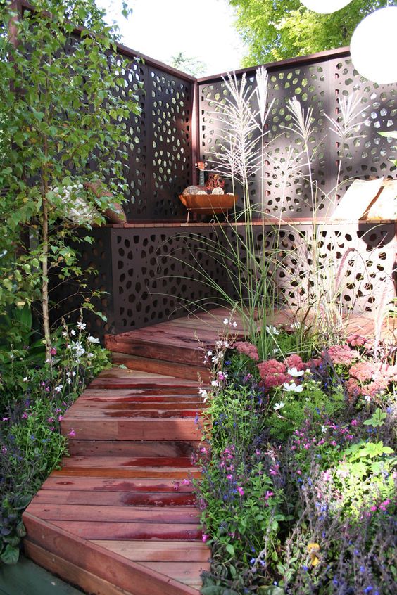
And if you decide these outdoor privacy panels are not for you, you still get a decent background panel for your plants or your favorite planter.
If however, you do fall in love with the Arabian light, step up your game with The orient screen.
This is a 90% block-out screen, that is all about that middle eastern vibe. It’s sold as a surface cover and feature, but don’t listen to them. The real magic happens when the light goes trough it. The small pin holes and dashes cast some very refined lights that instantly give any scene that Arabian bazaar feel, but without the smell of camels.
I know it sounds, niche, and it very much is. You need a wide area to use it in and you can only take advantage of it for maybe an hour or more on certain days when you have that strong low hanging sun and no overcast. But it’s a spectacular effect and considering that it comes dirt cheap, it’s probably the best thing you can do for the money, the alternative would be to actually set up a natural stone wall waterfall or a pool grotto. It’s that powerful.
And lastly but far from the least impressive are the Star Anais outdoor privacy panels. These are probably the best panels for getting creative with. Technically it’s a 90% geometrical pattern, but it looks excellent with everything. It has an oriental vibe, it blocks light both sunlight and wall reflection but you can also use it as a light source for indirect light.
It can hide spaces and at the same time depending on how much light you have behind it, it can show spaces because the openings are really long and allow for really good glimpses at the shapes behind it if they are properly lit.
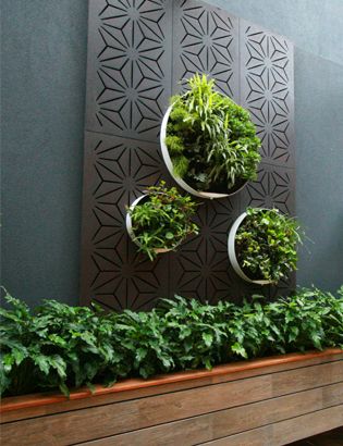
So why do you need anything else if it does everything really well? Well, it’s the pattern. It takes some time to get it, and really appreciate it’s beauty. A decorative outdoor privacy panel or even a hypnotic mahjong you instantly resonate with. And 2 or more panels like the Leafstream and Wooloomai just blend in together. These not so much, as they are made to work as individual panels.
But on the other hand, the pattern is such an amazing blend of geometric and natural that it goes both with modern and natural like nothing else and as you can see, it can span the visual gap between a flat gray wall and some lively greens better than anything else you can use. So if you know what you’re doing you should definitely skip everything else and get Some Star Anais pannels and play with them exclusively.


