A friend told me that she couldn’t find any small backyard design ideas online. Everyone is showing off farms, yards and luxurious patios with pools, but nobody has any advice for those that barely have a herb garden, techniques for a shared yard in between flats or at least a couple of small backyard design ideas.
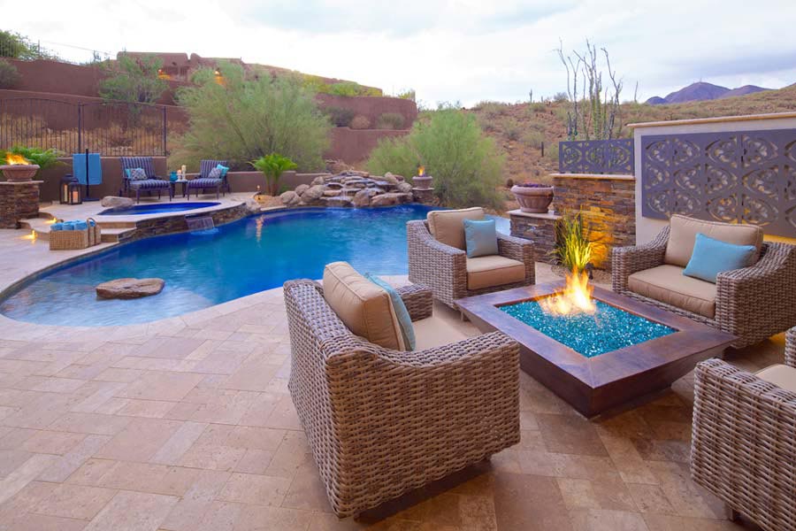
So I decided to write a guide specifically for people that don’t have a lot of space and want to know how they can make the best of it. I’ve broken down all my small backyard design ideas into categories according to the level we are talking about: macro, mid and micro landscaping.
Related: Backyard Landscape Ideas 2017 Guide
Mix and match them accordingly as you see fit.
The first type category is concerned with the use of segmentation at the macro level, the use of zones, dedicated spaces, and clearly defined areas.
The second part is about the use of segmentation within a scene, paths, lawns, and how to create density for depth without creating clutter. After that, we’ll talk about hot to segment vertically and take advantage of the third most important dimension when we lack space within the first two.
The third part will be a crash course in minimalism, modernism, solid shapes, colors boldness and how to reduce visual clutter at the micro level. And then I’ll end it with a list of the strongest assets you can get to implement these small backyard design ideas.
Zones
The zonal design is a form of large macro level segmentation. This adds complexity, utilitarian depth without clutter. When it comes to small backyard ideas, this is probably the easiest to implement and have a strong effect.
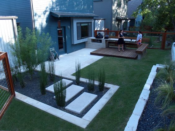
The only real rule is not to overestimate the versatility of the area. The only difference between a cluttered dining area and the feel of a smart compromise and a smart use of limited space is to feel.
If you don’t have enough room for a dining area make a lounge with a small couch if it’s too small to make it a playground make it a garden or lawn.
Overestimating and cramming people or landscaping assets is the only thing that can turn this into feeling like a compromise.
Corner of Heaven
If you have two solid adjacent walls, you can cover them in a light colored, solid material like rock, plaster impressions or stones and then spread out from them.
This design works best with square yards where one dimension is not obviously longer than the other, and you have a great view on one side of it.
A lot of Mediterranean patios take advantage of this trick: the large house as a background, small patio, and wide unobstructed view. Next time you see this on Instagram get your eyes off the view and just look how many feet the patio actually has.
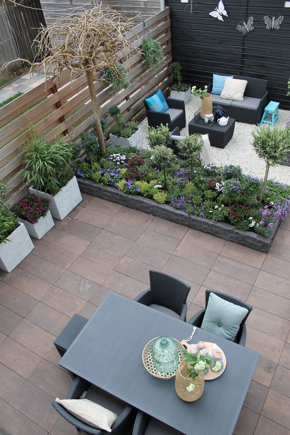
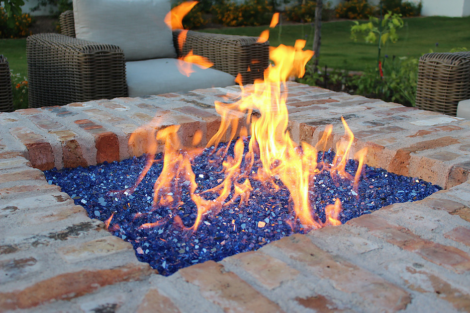
On the adjacent wall, you add a strong, impactful piece, like a water feature or fire feature. It doesn’t need to be large, you can get away with a small planter filled with fire glass, but make it clear and with intent.
Don’t leave any doubt that you have a fire feature on that wall. In between use a small coffee table with clean, smooth lines and clean texture. The contrast between the 2 distinct elements and the high textured walls and the small flat coffee table will create an added sense of dimension and space.
Actor and director
When in the scene, the view will give a feeling of space that will confirm the illusion of grandiosity set up by the massive stone walls. The two elements do work individually, but the view would be wasted without the grandiosity of the surrounding wall and fire feature.
The garden would just be visually compressed and shortened without any robust elements in the foreground to ground the eyes. While without the view the walls will give the sensation of massively but your eyes won’t be able to escape.
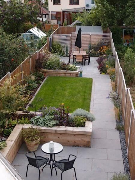
The technique is segmenting and clearly defining foreground, mid ground, and background for both the viewer and the user of the tableau. For the audience, you see a clear coffee table, the lounge elements and the walls as a background.
Behind you it could be anything. All you see is the small patio shadowed by the impressive landscaping. While for the people that sit in the scene, they have the table again in a very clear foreground, the mid ground will become everything under the line of the horizon with the eye transfixed by the lateral element and the background will be the sky.
Cut it in half
This is a risky one but works with longer yards and converted driveways. It adds a lot of lengths and visual depth. But it also risks looking improvised or accidental. Again, do it with intent. Add a lot of personalization and unique features within the micro to compensate for the bland macro.
So how do you do it? Simple, cut the space lengthwise in half. Keep one-half green and make the other half the gathering area. As long as the sitting area is wide enough to be comfortable you don’t have to worry about feeling cramped.
Also, be careful with the green area. Use small plants and landscaping so that you have leading lines to guide the eye lengthwise over the scenery.
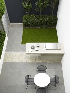
If you pull it off, it should seem like you have space to spare because you created 2 gardens in one, or a patio and playground, your choice.
The areas don’t have to be linked together or even work thematically, just keep the same style, arid, Victorian, pacific-islander, and it should work.
In fact the weirder the pairing, the better it works, water feature and grill area or lounge area with a fire feature table with the kid’s playground, work just as well.
Your eyes lie.
Always be aware of your perspective. That’s the basics of design. You can pull them towards the horizon, and your brain thinks that that’s where your property ends. Conversely, go around the Eiffel tower. It dwarfs the square which feels small by contrast.
Use leading lines to create length and an artificial vanishing point from the perspective of the people sitting. Add just a little bit of tilt and make them diagonals for some added width. We’ll get to lines and segmentation later.
But for now, try to make a simple area like a lawn or flower bed a linear experience rather than a focus point. We’re playing with surfaces and spaces now. Don’t concern yourself with the details of the specific areas. Just think of the eye movements.
Keep the eye moving and don’t let it stop.
Rule of threes
But what if you can’t comfortably use the patio area if you split your garden in 2 lengthwise? You cut it in 3 squares. You should get 3 squares that should work on their own. You won’t get all that much greenery.
But space will seem a lot more functional and useful which will increase complexity and apparent depth, without creating clutter. Theoretically, you could do it in quarters, but if you have space for four comfortable areas within your yard, you don’t need small backyard ideas, you need just basic backyard design ideas.

Go for any combination of patio, dining area, fire feature, water feature, flower garden, children’s play area, lawn, water feature. Just keep in mind to put the natural area further from the house than the more artificial ones.
Fell free to create some separation between the zones with privacy panels, but only partially.
Let people see from one area to the others, so don’t completely cut off one space from another and maintain an illusion of a common area.
Another element we can introduce here is height. The view of the people sitting in the lounge area should look down and out. Don’t obstruct view with a large element that makes the viewer feel crowded.
Feel free to elevate the patio or dining area slightly to give it that little extra bit of view.
Segmentation
This could be a whole post onto itself. But let’s talk briefly about paths, borders and arabesque lines, and everything in between.
Middle ground segmentation in particular. In a large yard, borders define and delimitate larger tableaus, they are only accents serving a higher purpose.
They should never create the effect or set the larger scene.
But they work a little bit differently as small backyard design ideas. In small spaces, we use them to grab attention but not let them dwell in a single spot for long.
The more clarity you have where a flower bed starts and where it ends the more your eyes will stay between the lines. And that’s what we want when the flower bed is half the garden.
At the same time, paths trick the eye and create length or width when they are diagonal, while arabesque lines take it for a walk, across the landscape.
The difference is infinitesimal on the stopwatch, but those extra milliseconds of lingering are enough to create a different perspective.
Paths and gravel
So because eyes stop at the border between two zones the most defined of areas, gravel pits, become an essential feature. You have an excellent way to add volume to a rectangular table or flower bed, without actually occupying a lot more space. Here’s a few examples of landscaping rocks and designs in action.
Make sure just that there’s some breathing room in between the asset and the margin of the round gravel pit and you should be good.
When it comes to alleys there’s only one option. Large slabs of light gray stone wider than both your feet, side by side in a symmetrical fashion with plenty of breathing room in between, they will create the impression of a wide path, that will stretch across your garden create the illusion of space and volume without occupying any actual space.
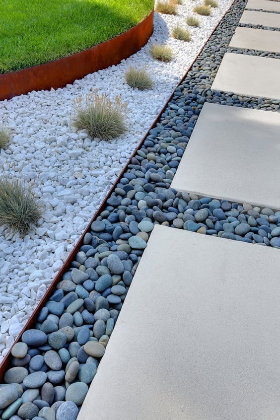
Your brain knows that the track is wide and automatically assumes that it’s just as wide 10 feet away, so it adapts its impression of the end of the yard about the trail’s width. This creates an unintended vanishing point that creates the illusion of space continuing beyond the horizon.
You can exaggerate this effect by narrowing the alleyway towards the end of the yard or creating a hump before the end of the pathway, behind which the path actually ends.
Levels
Another way to differentiate and create complexity without wasting space is abusing verticality. Whether you use steps, platforms or different sized bushes, use verticality to build interesting combos without taking up a lot of square footage in your garden.
Tall hedges walls with eye drawing elements towards the top of them. Create platforms and lift your patio or dining area. Instead of wasting space by creating a rock garden or plant bed, use some wall mounts and “paint” the walls green.
Hang some potted plants, let some foliage hang down low Think of your walls as an additional surface area for your garden. And here’s where the cool little touch that is privacy panels come into play.
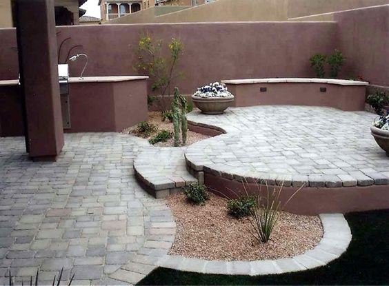
Play with height. In the space of a few feet that you would use just for one element, one flower bed, you can have a complete feature if you put those plants on different layers and stack them in a rice field style.
One of the coolest small backyard design ideas I’ve ever seen recently were these fascinating planters that worked like a pyramid or spiral. Sitting one inside the other and gaining height, put that in the middle of your small garden as a central feature instead of a flower bed and another feature.
Speaking of flowers and height, be very careful about plant sizes, it can get crowded very quickly with larger plants. Keep them tall or short but always thin.
Bold and beautiful.
All we’ve been talking about up to this point has been about making your yard more crowded, adding more elements. But here’s the kicker, all those layers and crowded design ideas, get balanced out at the micro level.
Close up, every item you use needs to be boring, untextured. Use solid bold colors that have no complexity. Simple linear patterns that come out of the mind of a toddler.
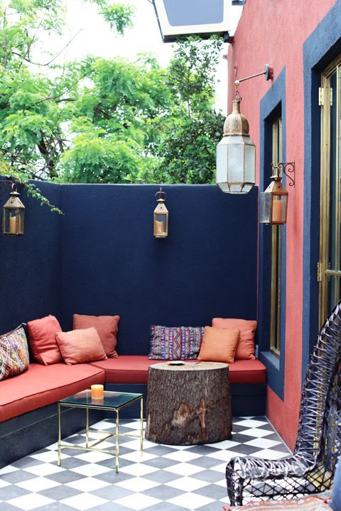
The untextured simple flat surfaces will allow the eyes to gloss over quickly or not even focus in at all, this makes a complicated scene accessible, minimalistic and is perceived as being very tasteful. This enables you to get away with maneuvers that would look horrible in a larger yard.
Let me give you 2 examples to illustrate my point so you can get a better feel for the micro-macro balancing act.
The zen garden
Zen themed gardens. Due to the minimalist surfaces, it’s very hard to pull off large zen theme gardens. Using more elements breaks the clean, minimalistic theme and keeping the sparsity will make it seems ascetic, destitute and barren.
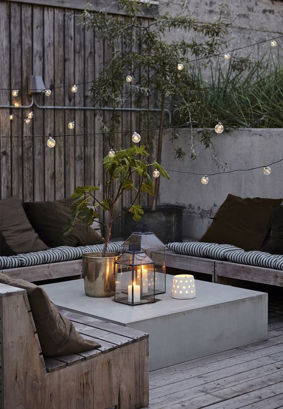
An attempt to fix this is using larger or bolder, more contrast-y elements. But it never actually gets rounded well enough to compete with other uses of the Zen style, and you’d clearly be better served by trying something else for your large yard.
Cacti beds
My second example is the flower bed. I usually encourage large expansive foliage that yells out: look at me, I’m in bloom! I hate cacti and restraint when using plants.
But that doesn’t work on a small scale, your asset will look, either clumsy if you use only a handful of plants or improvised and indecisive.
While taking advantage of the intertwining foliage would create a density that when used on a small wall or with not enough space it would seem crowded and forced.
I have to admit, for small areas, smaller, simpler is better.
Color and patterns
I like clean shades of gray but some will need to boost their look a little bit more, so this is one of the few times that you can let your freak fly, color wise. Use bold complementary colors and make a statement.
Just use flat, unimpressive textures. Most modernist features work down sampled as small backyard design ideas. Abuse the diversity found in plastic features and the versatility of concrete. Make it your own just keep it clean and unimpressive.
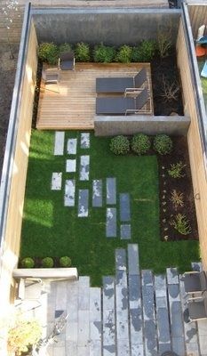
Another customization for the simple, bold surfaces is the use of patterns. Like I said with borders, keep them large, uncomplicated and easy to see and gloss over. Watch out! Creating a pattern vertically with some hanging terra cotta potted plants is different than creating a pattern made of cacti in a flower bed.
Horizontal patterns can be more crowded than vertical ones. We’re more used to them. Be mindful of spacing and kept to the basics: triangle composition and diagonals.
Simple and clean.
Goes without saying that one sure fire way to crowd a scene is not to maintain it. Mess untidiness and clutter go hand in hand, and I personally saw how it can quickly turn a whole warehouse into a New York loft.
Use fewer elements, simple, tidy lines, and functional design to keep the scene as clean as possible at the micro level so that the layers on the macro level can do their magic.
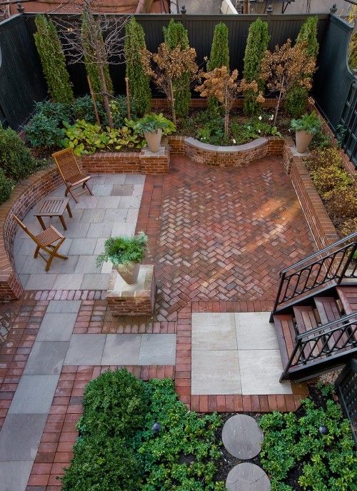
For any small area, Maintenance is crucial. Particularly in the city and especially during fall. Keep it everything clean and trimmed.
I hate to say it, but laws work perfectly in small spaces and by keeping it nice and cut you get that cool, clean carpet look and feel that will give the appearance of good taste and restraint instead of regret for the small space.
Same goes for gravel pits. If tidy, excellent, but it gets messy fast, and that can turn a pleasant feature into a bad feature overnight, literally if you have some strong wind.
Top assets
Conifers and dwarf plants
I know this is a no go for some of you, but some of them can be cute. I’m not really fond of them either, to be honest, but they just work.
They add just enough green and life to a small alley/yard, and they just infuse so much life into a small concrete urban back yard in between flats. And if used sparingly the have a lot of character without taking up space or eclipsing other elements.
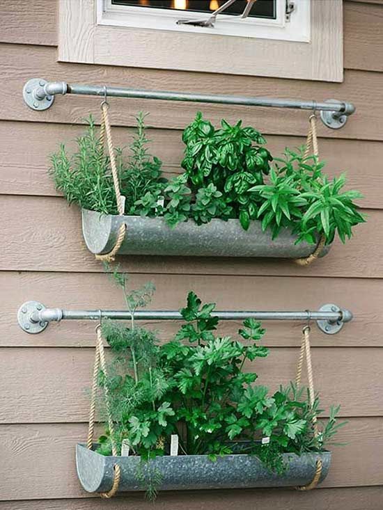
Give them a try, if you must combine them with privacy walls and spread them vertically. Speaking of which.
Vertical plants and hangers.
Tiered plants, stacked planters or spiral flower beds. If you can get it off the ground, do it. One of those spiral/hemispherical planters works great as a central feature with minimal square footage.
Moving up, literally a level.
Pot racks and supports, suspended vines, hanging climbers. Add some suspended or hanging potted greens to the top of the walls for even more elevation, height, and depth of the scene.
I may be more hesitant in going with a full arch as that crowds the area too much and cuts off the horizon. That being said, I saw an ivy branch over a doorway in France, which worked as a great small backyard design ideas.
Let’s just say you can pull it off but it’s not a rookie move. But otherwise, spread the ivy. There’s no reason to neglect any wall and leave it as it is.
Lawns and gravel
Use circular perimeters and clearly defined edges to get the most out of your area. Flat surfaces make simple features more evident and give them a sense of purpose. And you will be using simple small features in small gardens.
Without a gravel background, a stool is a lonely chair, with a background it becomes a landscaping element place there with intent. Same goes for lawns. It makes the difference between a low-budget imitation of a public park playground and a special play area for the kids.
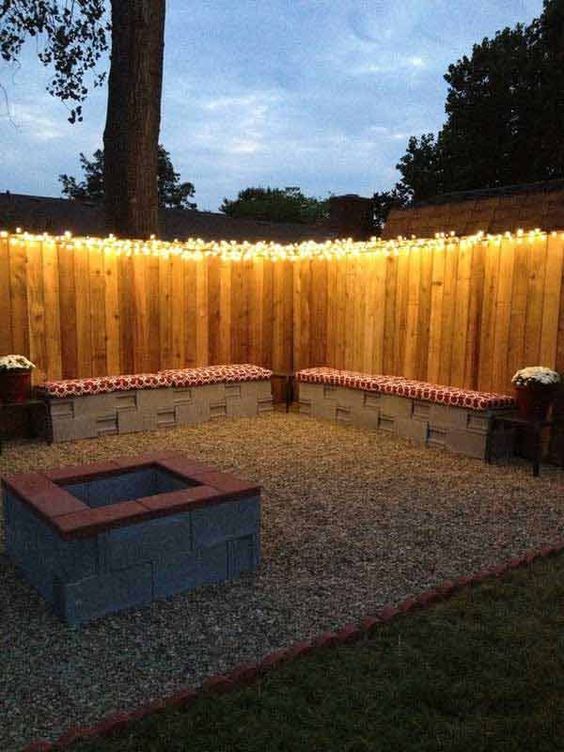
Lawns do work as simple coatings of “large” segments of the yard so they can be rectangular stretching from edge to edge. As long as you use it someway obviously.
Critical note, anything wider than an alleyway and this gives the impression of weak, uninspired landscaping. Don’t even attempt large surfaces of simple greenery if you have a large yard and you’re not going for the golf course look.
Patterns
Whether in your deck, plant beds, paths or walls, use large sparse patterns that make the eye glance with speed not stopping.
The continuous movement gives the impression of space. Here are some concrete, ideas. Rhomboid/ triangular potted plants hanged on walls. A sinusoidal gravel path leading to nowhere but becoming narrower and narrower towards the end of the yard, faking a faux vanishing point.
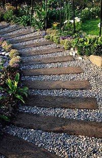
Place around it some semi-circular lawns in that alternating fashion, and you get a fascinating composition that can fit into the smallest of alleyways.
Upgrade that with some spiraling flower beds growing out of the semicircular lawns and slab some large symmetrical flagstones on the path to add more width to it.
This will require more space, think 2 car driveway. But it will give you more complexity than you really need to.
Put some lanterns in between each flower bed if your yard has the extra length and you created a visual adventure for anyone that comes to see your small but powerful composition.
Mirrors
I would say smoke and mirrors this one is all about illusion and the hint of extra space. Use mirror panels on a privacy wall to open up space. Place them on plants and larger assets to give the background depth and light.
Speaking of light, catch it with mirrors and this isn’t just a small backyard idea. An Italian friend of mine had only a small shared yard to work with, surrounded by those 2 story Mediterranean houses.
She bought 2 large full-length old mirrors and put them on the back of the doors to the veranda above the average yard. Every summer evening, it would catch the lovely golden hour sun reflects it onto the interior walls of the courtyard.
The walls had a golden tint that made their diffusion even warmer. The feeling of that simple courtyard where you can barely fit 5 Fiats was like something out of a fairytale. Mirrors can turn the environment into something special, just be mindful and don’t blind your neighbors.
Concrete.
Let’s put bricks here as well. Keep the assets bold, exciting but simple. Modern patio furniture raised fire pits/coffee tables, small walls are some examples of what you can do. Check out some fire pit accessories here.
A little can go a long way within a small space, so consider this before you go for some of the more substantial assets you see online. Plastic and concrete are great because they can be downsized massively and there’s a lot of options out there.
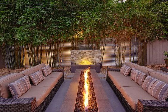
A very simple compo is a raised sitting area, for 2 people so that they can both look diagonally at a yard with 2 large planter assets that have some height to them, maybe a staircase-like arrangement.
Upgrade that to concrete planters that “grow out of the wall” maybe some simple wood stain to match your house and then a gravel path around a lawn with some minimalist bright tulips.
Lounges, coffee tables, downsized waterfalls and fire glass
Cram the sitting area right next to one wall a slim, long sofa will use space a lot more efficiently than a table believes it or not. When sitting around a table, there’s a lot of dead space right in the middle that isn’t actually occupied by people.
While with a sofa that dead space is minimal. Behaviorally It’s more relaxed which encourages people to fill more space and feel less cramped. A coffee table can give you a smaller footprint, and because of the lower height, it also leaves a lot of space above and around, so people don’t feel crowded.
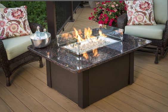
Downsizing also works great with other features. For a waterfall, all you need is a water source, a path, and a collector. That can be anything and size doesn’t matter because the eye will never notice the difference between 2 inches or 30 inches of water.
Fire glass is even more powerful. As long as it’s unobstructed, a glimmering gas fire installation will light up the whole yard without any issue, which is a great small backyard design ideas.
Put it on a wall, a concrete rafter or in the middle of your coffee table and come nightfall the size of your garden will fade into the darkness and the atmosphere will infuse with the warmth of the fire.
If you only use your garden in the evening, a fireglass installation is probably the best bang for your buck regarding small backyard design ideas.
Plastic is fantastic
Small backyard design ideas might be to come up with on your own. But using our inspiration guide you can model your yard after a design you like whether that be the earthy feel of sophisticated textures, shadows, and mid-tones.
Or, if you’re a bubbly type that loves glitter and bold colors, then doing something with colorful fire glass or landscaping pebbles will be suiting.
As long as you don’t add too many elements literally anything goes in small spaces, the bolder, the better. Start with some bold throw pillows for your lounge and scale it up from there. Bright red bricks with a glossy plastic finish.
Tall faux post-modern lampposts made of semi-translucent white plastic. I’ve seen them filled up with bright red and yellow fire glass alternatively and shine warm light over a large balcony.
Small Potted cacti in the shape of a heart hanged a barren side wall that dwarfs the yard.
Finally, be sure to shop our incredible extended collection of Fire glass, privacy panels, and landscaping rocks for your hard; at Exotic Pebbles here.


